Read the estimated model parameters and produce figures for the manuscript. Output will be a bunch of figures including prediction vs observation plots. Boxplots summarizing the model performance in terms of RMSE and RPIQ, as well as plots visualizing the chill and heat submodels in form of temperature response curves.
Prepare the parameters
For convenience we convert the parameters in the standard format, that PhenoFlex expects. I wrote a little helper function, that automatically checks which sets of parameters need to be converted and which not.
In [1]:
library(tidyverse)
── Attaching core tidyverse packages ──────────────────────── tidyverse 2.0.0 ──
✔ dplyr     1.1.4     ✔ readr     2.1.5
✔ forcats   1.0.0     ✔ stringr   1.5.1
✔ ggplot2   3.5.2     ✔ tibble    3.3.0
✔ lubridate 1.9.4     ✔ tidyr     1.3.1
✔ purrr     1.0.4
── Conflicts ────────────────────────────────────────── tidyverse_conflicts() ──
✖ dplyr::filter() masks stats::filter()
✖ dplyr::lag()    masks stats::lag()
ℹ Use the conflicted package (<http://conflicted.r-lib.org/>) to force all conflicts to become errors
library(chillR)
Attaching package: 'chillR'

The following object is masked from 'package:lubridate':

    leap_year
library(LarsChill)
Loading required package: magrittr

Attaching package: 'magrittr'

The following object is masked from 'package:purrr':

    set_names

The following object is masked from 'package:tidyr':

    extract
library(tidyverse)library(chillR)library(LarsChill)#devtools::install_github('larscaspersen/eval_phenoflex')#helper function that converts the parameters of the intermediate format (theta_star, theta_c, pie_c, tau) to the proper format that phenoflex expects (E0, E1, A0, A1)convert_all_par <-function(par_df){#identify which rows need to be converted conv_i <-which(is.na(par_df$E0) |is.na(par_df$E1) |is.na(par_df$A0) |is.na(par_df$A1)) if(length(conv_i) ==0) return(par_df) par_df_no_conv <- par_df[-conv_i, ] par_conv <- par_df[conv_i,] par_conv <- purrr::map(1:nrow(par_conv), function(i){ par <- par_conv[i, LarsChill::phenoflex_parnames_new] %>%unlist() %>%convert_parameters() %>%unname()return(data.frame(E0 = par[5], E1 = par[6], A0 = par[7], A1 = par[8])) }) %>%bind_rows() par_df[conv_i,] %>%select(-E0, -E1, -A0, -A1) %>%cbind(par_conv) %>%rbind(par_df_no_conv) %>%return()}#read model parameterspar_cherry <-read.csv('data/par-cherry.csv') %>%mutate(species ='Sweet Cherry') %>%convert_all_par()par_apricot <-read.csv('data/par-apricot.csv') %>%mutate(species ='Apricot')%>%convert_all_par()par_almond <-read.csv('data/par-almond.csv') %>%mutate(species ='Almond')%>%select(-repetition) %>%convert_all_par()par_all <- par_almond %>%rbind(par_apricot) %>%rbind(par_cherry)rm(par_almond, par_apricot, par_cherry)write.csv(par_all, 'data/par_all_slim_paper.csv', row.names =FALSE)
Predict bloom dates for calibration and validation data
Next task is to prepare the temperature data and predict the bloom dates using the different parameter sets. We also need to read the actual observation data for the comparison later.
In [3]:
#compare the prediction accuracy for the different cultivars and modelsmaster_apricot <-read.csv('data/master_apricot.csv') %>%select(species, cultivar, yday, year, split, ncal, location)master_cherry <-read.csv('data/master_cherry.csv') %>%select(species, cultivar, yday, year, split, ncal, location)master_almond <-read.csv('data/master_almond.csv') %>%select(species, cultivar, yday, year, split, ncal, location)#combine the different master files to one grand data.framemaster <- master_almond %>%rbind(master_apricot) %>%rbind(master_cherry) %>%mutate(loc.year =paste(location, year, sep ='.'))rm(master_almond, master_apricot, master_cherry)#read temperature datasfax <-read.csv('data/sfax.csv')meknes <-read.csv('data/meknes.csv')santomera <-read.csv('data/santomera.csv')zaragoza <-read.csv('data/zaragoza_clean.csv')cka <-read.csv('data/cka_clean.csv')cieza <-read.csv('data/cieza_clean.csv')weather_list <-list('Meknes'= meknes,'Santomera'= santomera, 'Sfax'= sfax,'Zaragoza'= zaragoza,'Klein-Altendorf'= cka,'Cieza'= cieza)station_list <-read.csv('data/weather_stations.csv', sep =',', dec ='.')#generate seasonlistseasonlist <- purrr::map2(weather_list, names(weather_list), function(weather, stat){ ymin <-min(weather$Year) ymax <-max(weather$Year) weather %>% chillR::stack_hourly_temps(latitude = station_list$lat[station_list$station == stat]) %>% purrr::pluck('hourtemps') %>% chillR::genSeasonList(years = ymin:ymax) %>%setNames(ymin:ymax) %>%return()}) %>%unlist(recursive =FALSE)rm(zaragoza, cieza, cka, meknes, sfax, santomera, station_list, weather_list)
Now we can do the actual bloom prediction. I use the purrr::map function, which works similar to a for loop or lapply, with the extra benefit of being a bit faster and having a convenient loading bar implemented. I iterate over the rows in the parameter data.frame and predict bloom dates for all the respective entries in the seasonlist.
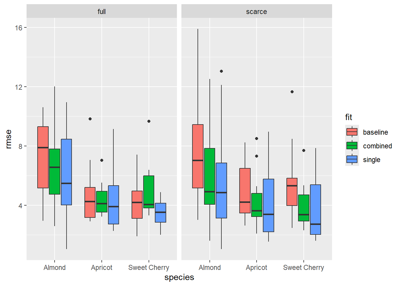
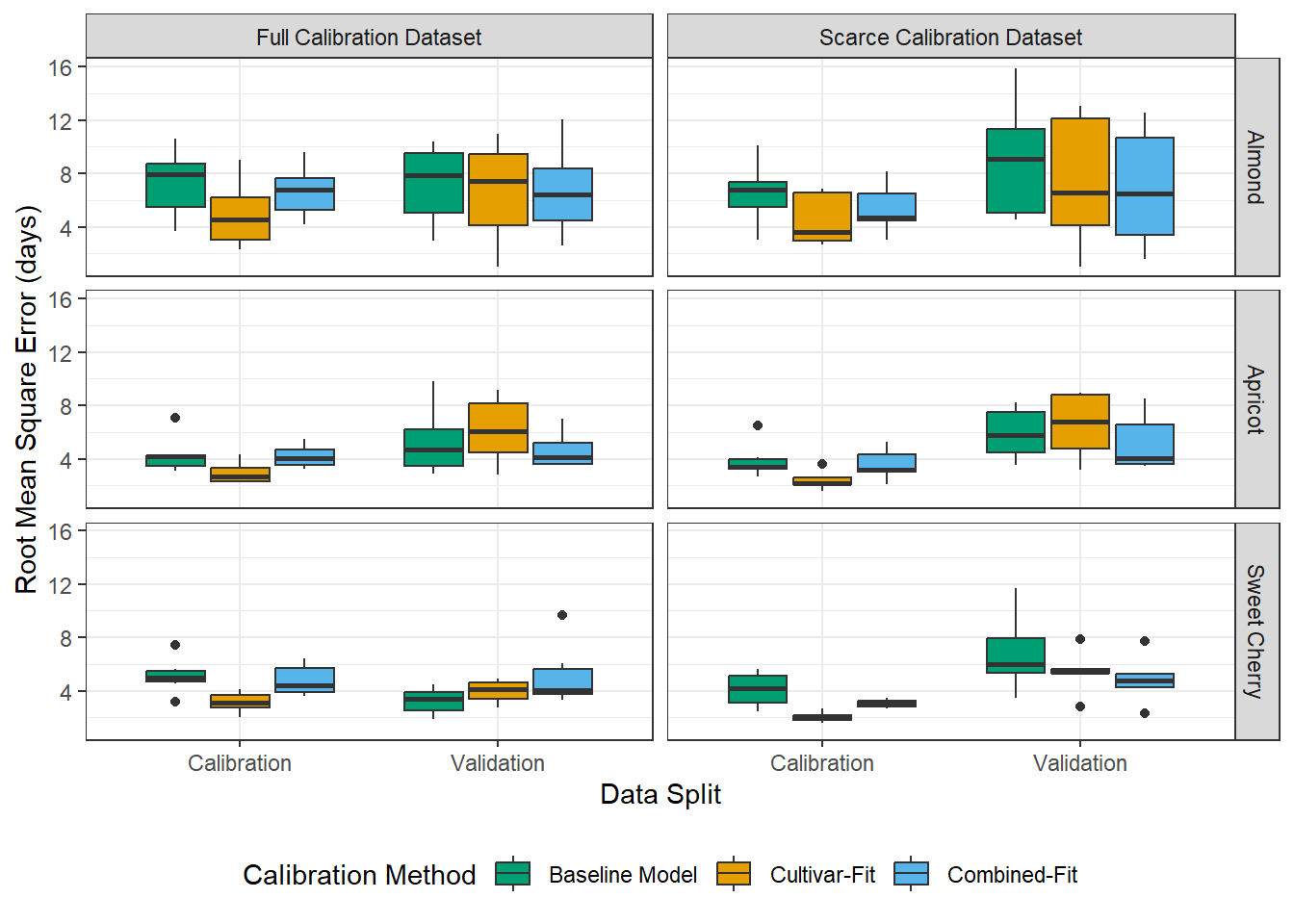
At first, let’s look for effects of the four variables: ncal (calibration dataset size: scarce or full), fit (calibration method: single, combined or baseline), species (almond, apricot, sweet cherry) and split. (calibration, validation). Initially, I was expecting to see that baseline model and combined fit may outperform the single calibration for scarce data set, because they require less parameters. Also, it was commonly suggested, that 10 observations are not sufficient for the single calibration method. That turned out to be not true.
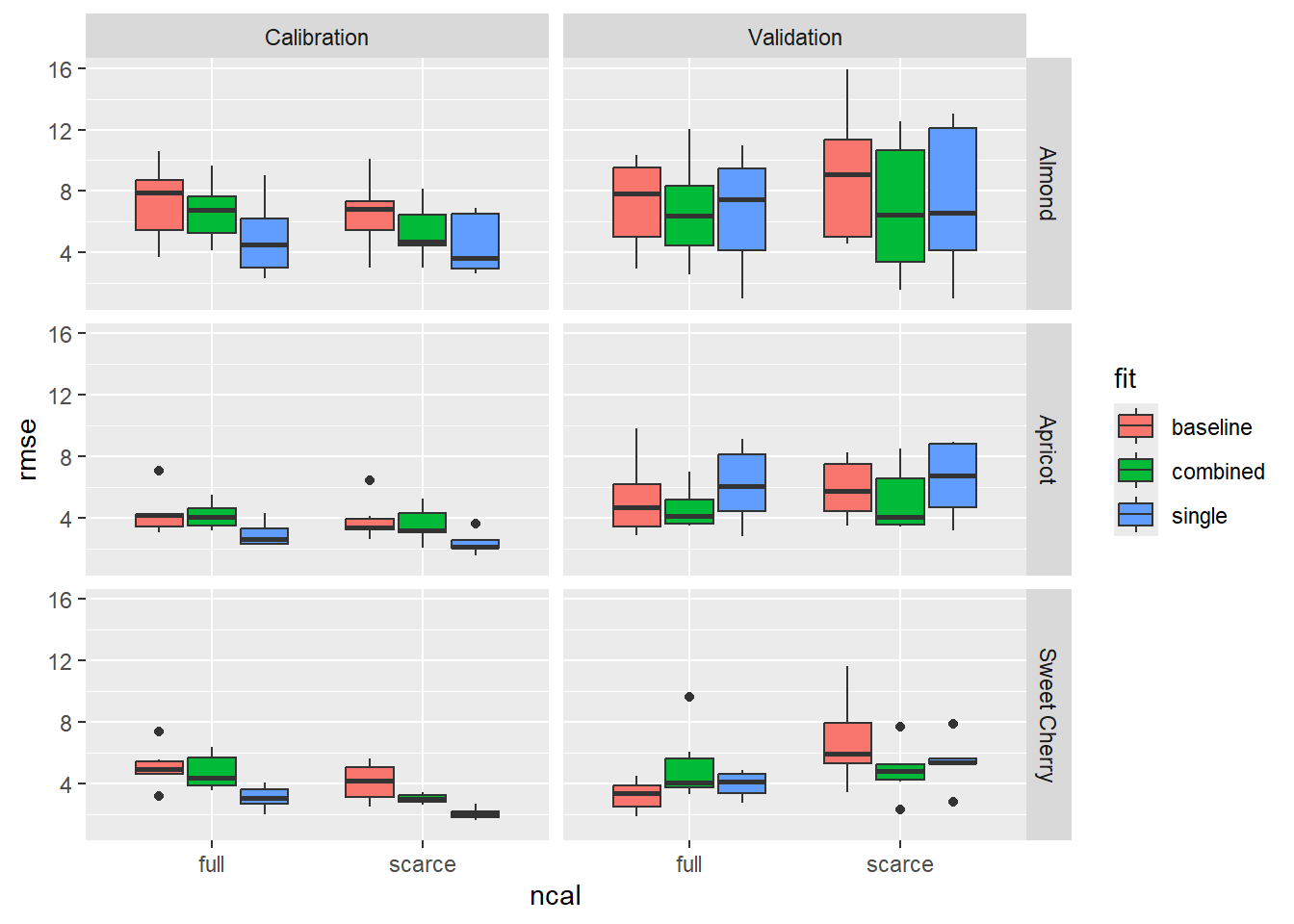
#emphasize the difference in calibration and validationperf %>%mutate(ncal_plot =factor(ncal, levels =c('full', 'scarce'),labels =c('Full Calibration Dataset', 'Scarce Calibration Dataset')),fit_plot =factor(fit, levels =c('baseline', 'single', 'combined'),labels =c('Baseline Model', 'Cultivar-Fit', 'Combined-Fit'))) %>%ggplot(aes(x = ncal_plot, y = rmse)) +geom_boxplot(aes(fill = split)) +facet_grid(species~fit_plot) +ylab('Root Mean Square Error (days)') +xlab('Size of Calibration Dataset') +theme_bw()
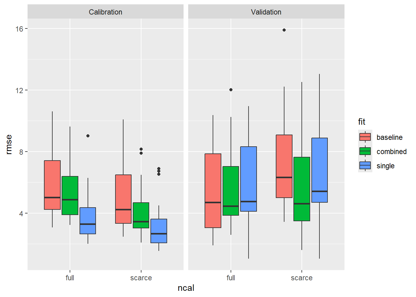
Next, I want to check if the difference in calibration and validation differs a lot. This may be an indicator for overfitting. The single-fit data based on the scarce calibration dataset shows signs of overfitting. But it in the plots above we didn’t see that the validation performance of single-fit data was worse than in the other treatments. Rather, it seems that the calibration performance of single-fit was just better, but that did not translate into better validation performance.
In [10]:
#table for writing test <- perf %>%group_by(species, ncal, fit, split) %>%summarise(median =median(rmse) %>%round(digits =1),sd =sd(rmse) %>%round(digits =1))
`summarise()` has grouped output by 'species', 'ncal', 'fit'. You can override
using the `.groups` argument.
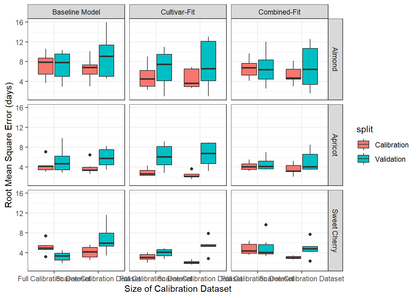
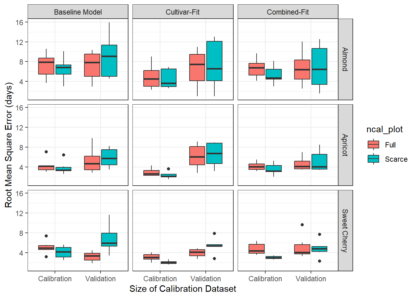
#emphasize the difference full and scarceperf %>%mutate(ncal_plot =factor(ncal, levels =c('full', 'scarce'),labels =c('Full', 'Scarce')),fit_plot =factor(fit, levels =c('baseline', 'single', 'combined'),labels =c('Baseline Model', 'Cultivar-Fit', 'Combined-Fit'))) %>%ggplot(aes(x = split, y = rmse)) +geom_boxplot(aes(fill = ncal_plot)) +facet_grid(species~fit_plot) +ylab('Root Mean Square Error (days)') +xlab('Size of Calibration Dataset') +theme_bw()
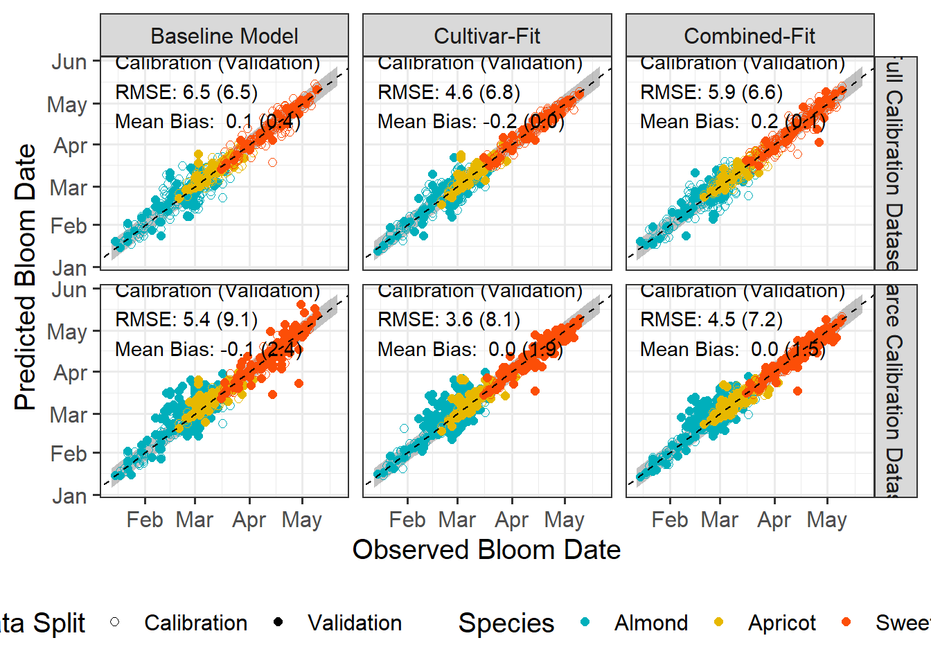
Predicted vs Observed
Next, I want to generate a plot where predicted and observed bloom dates are visualized more explicitly. For that I will need some helper objects that will make plotting easier.
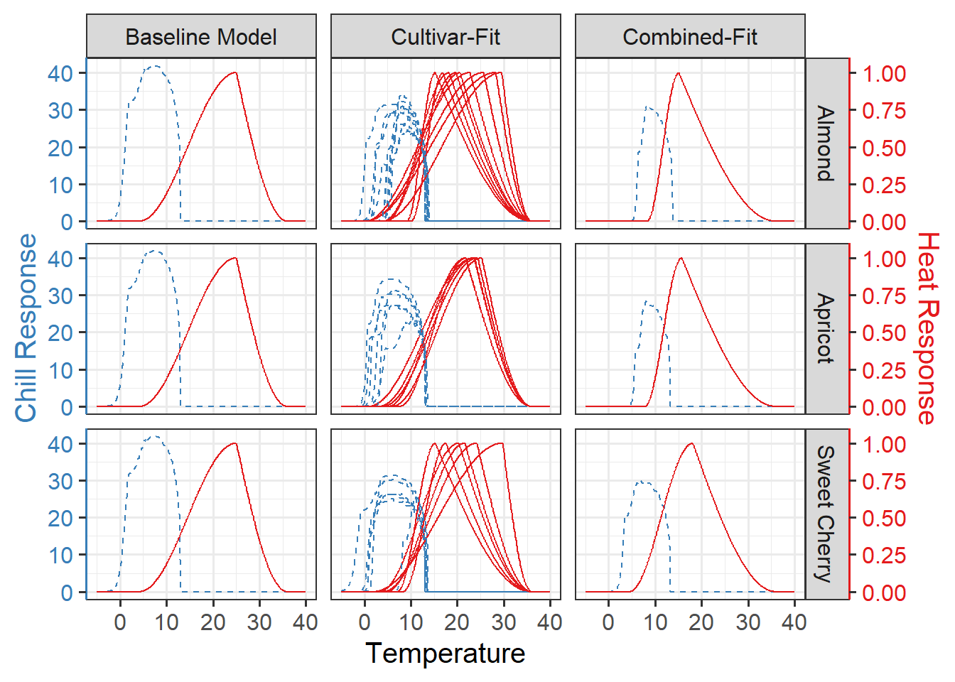
We did not find stark difference in the prediction performance, but we may inspect the parameters themselves. Temperature response curves are a convenient tool the visualize how the parameters translate into the temperature sensitivity of the submodel.
The LarsChill package has some convenience functions for generating he temperature response curves. It has also some functions to visualize them, but we make our own code for that
For the sake of completion, I will also generate the temperature response curve of the scarcity dataset and a combine figure were the curves for both treatments are shown.
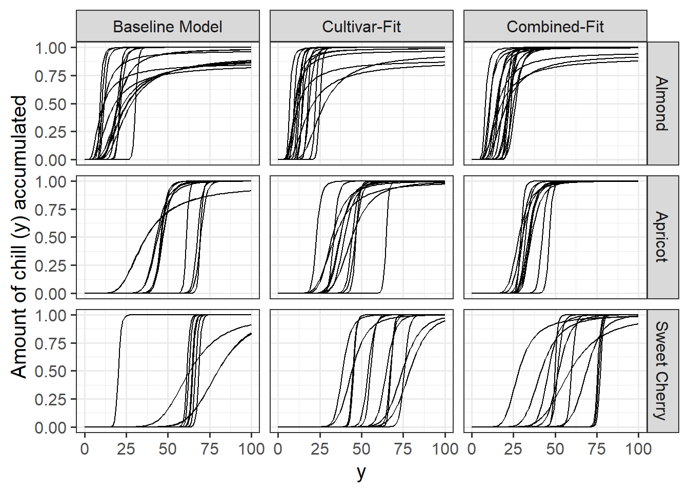
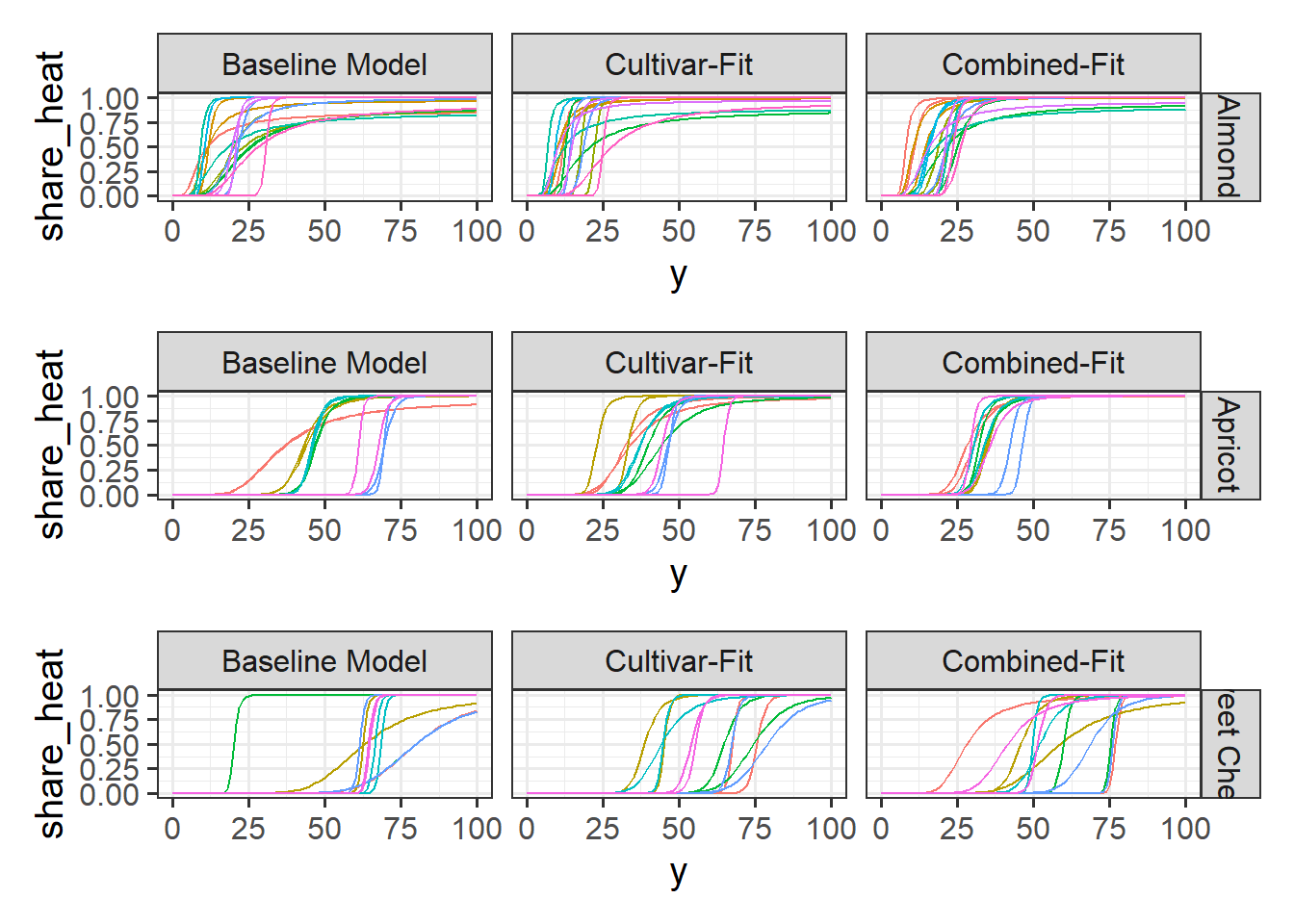
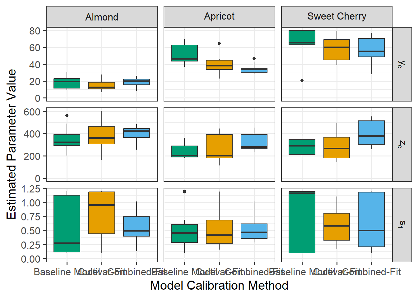
I decided to also make plots for the cultivar-specific parameters: vc, zc, s1.
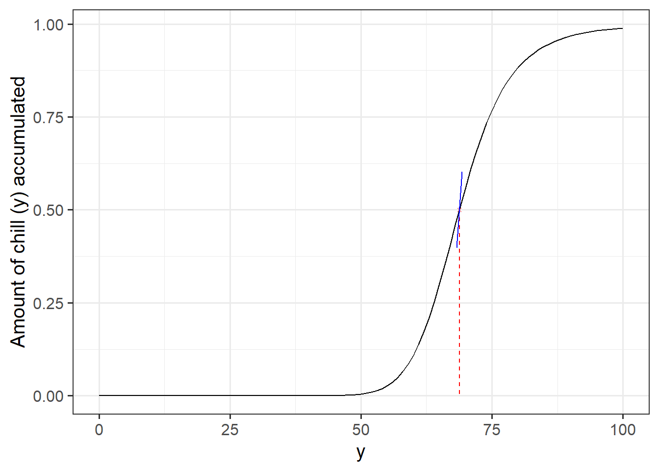
First, I tried to graph for myself what s1 actually means. The black line is the function representing the share of potential GDH that gets actually accumulated depending on the level of chill accumulation. The idea is, that the more chill is accumulated the more heat can be accumulated. The chill requirement yc (red dashed line) moves the curve left or right. The steepness of the curve is determined by the s1 parameter (blue line). High values of s1 lead to steeper, more step-like transition function. Lower s1 value lead to a more leaning function.
In [21]:
#vizualize also the transition parameters. yc and s1get_share_heat <-function(y, yc, s1){ sr <-exp(s1 * yc * ((y - yc)/y))return((sr) / (1+sr))}s1 <-1yc <-40y <-40curve_df <- purrr::map(1:nrow(par_all), function(i){ curve <-get_share_heat(0:100, par_all[i,'yc'], par_all[i,'s1'])return(data.frame(y =0:100,yc = par_all[i,'yc'],s1 = par_all[i,'s1'],share_heat = curve,species = par_all$species[i],cultivar = par_all$cultivar[i],fit = par_all$fit[i],n_cal = par_all$n_cal[i]))}) curve_df <-do.call('rbind', curve_df)#calculate the yintercept for the line around the infliction pointvector_length <-0.5step_right <-1curve_df %>%mutate(fit_plot =factor(fit, levels =c('baseline', 'single', 'combined'), labels =c('Baseline Model', 'Cultivar-Fit', 'Combined-Fit'))) %>%mutate(id =paste(species, cultivar, fit, n_cal, sep ='_'), a =0.5- (s1*yc), x_start = yc-step_right, x_end = yc+step_right, y_start = a + s1 *x_start, y_end = a + s1 * x_end) %>%mutate(x_vec = x_start - x_end, y_vec = y_start - y_end, length =sqrt(x_vec^2+ y_vec^2), x_einheit = x_vec / length, y_einheit = y_vec / length, x_plot_start = yc - (x_einheit*vector_length), x_plot_end = yc + (x_einheit*vector_length), y_plot_start =0.5- (y_einheit*vector_length), y_plot_end =0.5+ (y_einheit * vector_length)) %>%filter(cultivar =='Schneiders', fit =='combined', n_cal =='full') %>%ggplot(aes(x = y, y = share_heat, group = id)) +geom_line(show.legend =FALSE) +geom_segment(aes(y =0.5, yend =0, x = yc, xend = yc), col ='red', linetype ='dashed') +geom_point(aes(y =0.5, x = yc), col ='red', shape =4, size =1) +geom_segment(aes(y = y_plot_start, yend = y_plot_end, x = x_plot_start, xend = x_plot_end), col ='blue') +theme_bw(base_size =15) +ylab('Share of potential heat that gets accumulated') +ylab('Amount of chill (y) accumulated')
First is a plot that depicts how different values in s1 lead to different transition curves.